ianacare Mobile App
iancare’s mission is to encourage, empower, and equip family caregivers with practical tools and supportive communities, so no caregiver goes through this alone. Through 1-on-1 coaching with certified coaches, local resources made accessible and discoverable through the platform, and personal social circles immobilized by use of the the caregiver app, users are able to connect, coordinate, and offer support to those closest to them in need.
I joined ianacare in January of 2021 as their sole designer, inheriting a mobile application and design language created by previous contract-based designers. Over time I’ve leveraged and adjusted these designs to improve our customer’s experience, remove points of frustration for users, and make the product more marketable to both our end users and potential partners.
Since joining, I helped successfully push 6 versions to the app and play store with various enhancements and new features. I also worked with the co-founders to create an extensive backlog with features and additional tools that are scheduled to release over the coming months and calendar year.
Enhancement 01
Improving clarity & functionality of the app’s homescreen
Introduced in 2.3.0
One of the first things I noticed when I started using the mobile app was the homescreen didn’t convey a purpose and failed to drive the user to a specific task. The homescreen had too many CTAs and features that fell on the same level of hierarchy, too many items hidden behind scroll, and no clear data on what the user had done, was being asked to do, or had upcoming.
I wanted to address this by doing 3 main things…
Add a clear main CTA
Reduce space taken up by non-essential functionality
Group items of similar type, and create clear buckets of functionality

Call To Action Adjustments
In hopes to more frequently drive users to the main functionality of the app, asking and offering help, I adjusted the layout, placement, and emphasis of the “Get Started” button.
Different user types would be shown different copy to help them understand what the Get Started button would do, while the numbers underneath would add further reinforcement that the button would directly impact what they have offered, requested, or been assigned.
Adding the confirmed and pending events counters to the screen added a layer of dynamic content to a once fully static page. The counters not only helped users understand their current situation at a glance, but also allowed us to nudge users who may be under-engaging or reward those who had been more active on the platform. In order to avoid being too negative in certain situations, the counter would not be present if a user had no confirmed events and no pending events; though this situation would likely be fairly uncommon.
-
Reduce Space of Non-Essential Functionality
In the old design, the checklist, gift card, and Amazon Wish List items took up the top 50% of the screen, using essential real estate for non-essential tasks. The form factor of these items also lead to unintentional emphasis and user confusion.
By changing the form factor of these items to be less invasive and less attention-grabbing, we were able to direct the user’s eyes to the main “Get Started” CTA - this was further emphasised with the addition of the background blobs that flanked the CTA and directed users inward to the center of the screen.
-
Group Items of Similar Functionality
I moved the Amazon Wish List, Gift Card functionality, and other secondary actions to a scrollable carousel below the main CTA. We wanted to make sure users still saw this content, but we didn’t want it to be too prominent. The addition of the “Other Ways to Help” title also reinforced that users could both help with errands, or if they were not in a physical location that allowed them to do so, help with finance and shopping tasks.
We also moved the Resources section that was once hidden by scroll into a tabbed page, allowing users to see the section exists without needing to scroll. This also broke apart the “self help” from the “coordinated help” sections of the app. Some users would not see the Resources section of the app, so this allowed for an easy way to hide it by disabling the tabs when needed.
-
Other Visual Updates
Additional updates were made to the iconography of the app. The toolbar and nav bar were given updated icons that more closely resembled the overall look and feel of the brand as well as gave the app a more consistent feel.

Enhancement 02
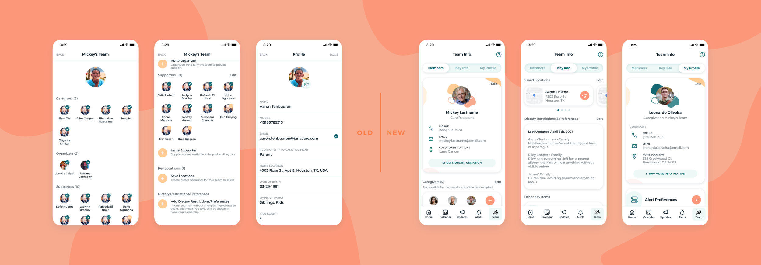
Reworking Team Info navigation, features, & hierarchy
Not yet developed
We wanted to take a look at the current Profile and Team section of the mobile app to see if there were any enhancements that could be made to further increase the impact this section could have on a user’s and a team’s experience. A few things we noticed were that the overall navigation did not follow a easy-to-grasp flow. Users would tap on a “Profile” tab in the main toolbar, but then would be brought to a page with links to “Alert Preferences”, “System Help and Support”, “Team Info”, and once again “Profile”. I wanted to address not only this navigational issue, but also update the functionality to make it more usable.
To accomplish this I…
Updated overall hierarchy
Reworked pre-existing functionality to be more user friendly
Brought pre-existing experience patterns from other sections of app to this page
Enhancement 03
Allowing users to store and share important documents
Not yet developed
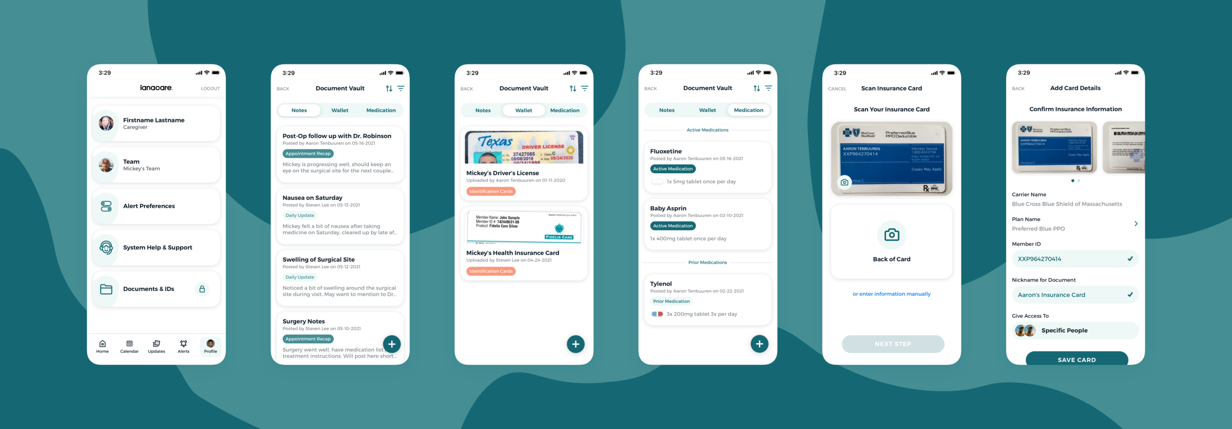
One of the main pieces of functionality we are asked for by our users is the ability to upload and store documents. Users want to be able to share across members of family, with caregivers, and with select supporters information about doctors appointments, identification cards, medications and prescriptions, and even legal documents.
To address this, we designed a document vault, which would allow users to add certain types of documents, free form and guided notes, and medications. Users would be able to share these items with selected members of the team and grant access on a person-by-person basis.
The hope is that this section of the app would allow users to more seamlessly assist with taking care recipients and dependents of caregivers to doctors appointments, allow for more detailed overviews of one’s progression through situations, and allow for caregivers and supporters to more easily track care needs of those they care for.
The document vault has not yet been developed, but is being geared up for an early 2022 release.
Enhancement 04
Making it easier to create tasks and events
Being released with 2.5
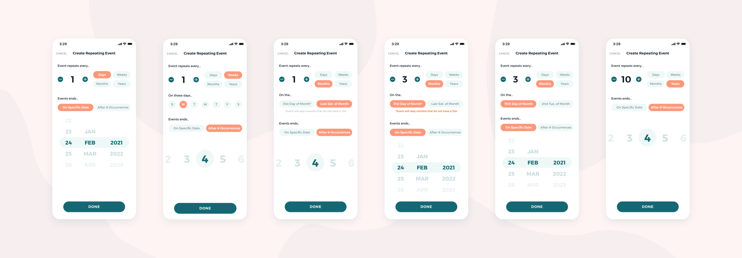
In its current state, users who wish to create a repeating event or request would need to manually copy and paste a single event they’ve created over and over again, or create new instances of the event for each occurence. We wanted to streamline this process and allow users to create events (just requests or self-notes at this time, not offers) that could take place over the course of days, weeks, months, or even years.
I wanted to build this feature out in a way that allowed the user to essentially create a sentence that described the way they were building the series. Carefully curated and worded titles and selection options that adapted to previous inputs would allow users to create easy-to-understand repeating events.
In the examples below, users have created…
Event that repeats every day. Event end on specific date of February 24th, 2021.
Event that repeats every week on Monday, and ends after 4 occurrences.
Event that repeats Monthly on the last Saturday of the month, for the next 4 months.
Event that repeats every 3rd month on the 31st of the month until Feb 24th, 2021.
Event that repeats every 3rd month on the 15th of the month until Feb 24th, 2021.
Event that repeats every 10 years and ends after 4 occurrences.
Enhancement 05
Making sure users don’t run into any ghost towns
Introduced in 2.2.0
One thing you absolutely don’t want users to run into is a blank page and with no idea what to do next. It’s not uncommon for a user to drop off when met with an empty screen or a task with no indication of how to complete it. Unfortunately, we had a lot of places where a user just might find themselves in that situation.
We decided to remedy this with empty states that showed users where they were, what they could do in that section, what a completed task looked like, and a clear CTA to complete that task.
This small change was immediately recognized and appreciated not only by our end users, but prospective partners who would constantly mention how the informative screens allowed them to understand what they could and should do within the app.
Key Metrics
4.8/4.2 App Store Ratings
iOS averaged a 4.8 star rating with 39 reviews, compared to Android’s 4.2 star rating with 43 reviews.
600+ Monthly New Users
The app is averaging over 600 new users and 200 new teams per month over the last 12 months.